The Good Design Journal
3 Gorgeous Kitchens To Brighten Your Day

Day going slow? Craving some gorgeous inspiration? Don't worry we got chu, with three of our favourite designer kitchens.
Unpacking groceries, prepping food, standing around waiting for the kettle to boil, casual chats around the island bench, the kitchen is a space you tend to spend a fair bit of time in. We like to call it a ‘sticky room’ because, well, it’s somewhere you tend to stick around.
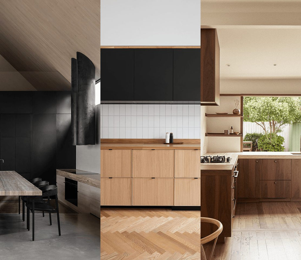
Kitchens tend to be the central hub of a home, and so it’s no surprise we’re seeing some absolute stunners popping up in recent projects. Below are three of our current faves. They each exhibit clever use of materiality, layout, or styling, and have us fantasising about what we could do with our own kitchens.
Barwon Heads House, Adam Kane Architects
Photography by Timothy Kaye
The team at Adam Kane Architects know how to design a kitchen. Their recently completed Barwon Heads House, as an example, demonstrates the perfect execution of a number of design principles. We’re talking scale, harmony, and repetition, all coming together to create this stunner of a space.
The proportions of this space are assisted by a ceiling that appears to never end, creating an open and very airy vibe. However, the gargantuan travertine kitchen bench/dining table (true art in our eyes) anchors everything back down to Earth. The contrasting rangehood is a feature in itself, and adds interest and a focal point to balance the relatively desaturated palette.
Bring this material-rich, look into your own home:
MJ Residence, Seear-Budd Ross
Photography by Thomas Seear-Budd
Based in New Zealand, Seear-Budd Ross (Thomas Seear-Budd and James Ross), are a multi-disciplined studio, bringing their unique aesthetic to all manner of projects, including residential, commercial, and hospitality, as well as interior styling, and furniture design. What can’t they do…
Anyway, on to their MJ Residence project kitchen. Though we’re torn about picking our favourite feature, we’re going to have to go with that stunning bi-fold window. The way it creates a connection between the outdoor garden to the interior space is seamless, a defining asset in this room. To emphasise this link is one very clever material palette, made up of visually natural materials like stone and timber, offset by ceramic sculpture and elements of stainless steel.
If you’re keen to blend the boundaries of the natural and the manufactured, check out our picks below:
Edinburgh Apartment, Luke McClelland
Photography by ZAC And ZAC Photography
This kitchen, by Luke McClelland, demonstrates the importance and power of details, and how they elevate a space to the next level. At first glance, you may look and think, what a lovely, minimalist room, and not really know exactly what you’re attracted to.
Guys, it’s the details.
The texture of the herringbone floor, the discrete raised edge of each drawer front, the colour of the tile grout, the way each pull matches the the black cabinetry above the bench – each may seem minor, but your eye catches these details, and tells your brain how great this space is. The culmination of considered design features results in a space that comes across as complete and tidy.
Bring gorgeous and considered details into your home, with these stunning pieces:


