The Good Design Journal
The Who's Who of The Colour Blue

It’s time for some colour and we’re dishing it out with one of our absolute faves: Blue. Join us as we check out different ways of incorporating this versatile colour into your space.
90’s kids rejoice – we’re all about to dabadeedabadie into our current colour obsession: blue! It’s not often we see much of this cool tone in today’s contemporary interiors, especially with the popularity of neutral palettes consisting of of beige, charcoals, and off-white.
But why blue? What is it exactly that draws our love and attention? Amongst many things, the number one attribute of this colour that keeps us coming back for more is its versatility. Though often associated with the feeling of calm, blue can also bring high energy and vibrance, when implemented creatively and in the correct amounts. It really does have a heap going for it, as you’ll discover below.
So let us share a number of different ways to incorporate this sometimes soothing, sometimes striking, colour into your own home. It’s time to take out your books jot down your notes, as we dive head first into all things blue.


Go Hard, Go Bold
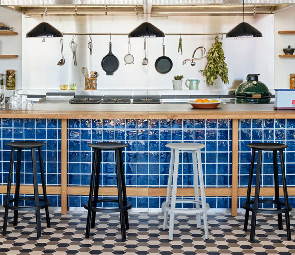
This one’s for the colour lovers. If you’re not about doing something half-arsed, and taking and all-or-nothing approach, blue is a fantastic colour to use as a base. In deep, electric tones, and used en masse, it brings a unique energy – one that’s both soothing and energising all at once!
What makes or breaks an all blue scheme is nailing your foundation shade. Consider the overall mood and story you want to tell in your blue room – are you looking to energise or soothe? Strong mid-tone blues, think primary blue, will invigorate the senses (see examples above), whilst tints and shades that fall on the outer ends of the blue-spectrum will often have the opposite effect, inviting calm and relaxation.
Our other piece of advice when working with an all blue palette is to commit to one or two variations of your shade or tint. This will help bring a sense of completeness to your overall scheme, and strengthen the energy you’re hoping to convey.


Just A Hint
From one extreme to the other, blue can be incorporated into your decorating and styling scheme through subtle yet eye-catching hints. Clever little pops here and there, will help bring contrast to a space, especially if you’re working it into a scheme consisting of colours from opposite points of the colour wheel.
We recommend your blue moments are bold, and opt for shades that sit somewhere along the mid-darker end of the colour spectrum. The purpose is to create a focal point, something to grab and hold attention, and it’s these tones that are most likely to achieve this. However, you can definitely opt for something more soft, it just won’t have that same impact – which is absolutely fine by us!


The New Neutral
So we’ve banged on about strong bold shades of blue, but what about those lighter tints? Don’t they deserve some time in the spotlight too?
This is where we get a little controversial (ooooooooh) and start making claims that carry with them little merit other than making sense in our mind. We think tints of blue on the lighter end of the spectrum, can be considered a neutral, and could be used as an alternative to whites and very light beiges.
We’ll give you a moment to sit and digest.
Because we’re working with a group of tones that promote relaxation and calm, it kinda makes sense. We’d just recommend going about a pale blue colour palette with two points to keep in mind:
1. Incorporate texture into the application – ie a vein in the stone, or the rendering of paint. This will help avoid creating something that appears washed out and boring.
2. Include contrast. A darker shade of blue or something with a bit of warmth (hello aged brass) will keep the energy of the space positive and lively.


Frame It An Pop It On The Wall
This section could technically be incorporated into our second blue-tactic, where you inject just a little hint, rather than going out. Why we’ve made an entirely separate area to talk about blue art… unsure, but here we are, so let’s do it.
We think blue artwork works best when:
a) The blue dominates the piece as the main colour
b) The blue in the artwork ties in to other decor pieces in a similar tint or shade
HOWEVER before you @ us, this is just a general rule of thumb, and rules and thumbs were meant to be broken. There are plenty of exceptions to this rule, one of which we’ll be highlighting below…


Mix And Mix And Mix
Here’s where you get the break the rules, you rule breaker, you. If you can get enough of the colour blue, in all its various tints and shades, then throw them all together, mix ’em up, and create that tonal paradise you’ve always dreamed of.
Biasol have taken this approach (see images above) in their old studio, mixing teals, navies, and sky blues together in a clever arrangement. The result is something truly harmonious, with the various tones emphasised by the predominantly grey background palette. So if the pros are doing it, then get wild and get mixing!


