The Good Design Journal
Your A-Z Of Design Lingo - F

Welcome back to our ongoing A-Z of definitions series. We're guiding you through a bunch of design words you may hear in the world of interiors, but not quite understand. We’re not throwing out dictionary definitions here - this ain’t no lecture. We’re keeping it chill and light-hearted, and we’re moving on to the letter F.
Finish
Finishes, simply put, are the final surfaces of an element. Finishes add interest and tacility – something to satisfy the senses, whilst fulfilling the need for durability and sustainability. Beautiful finishes are at the crux of Scandi design, with a focus on nature and craftsmanship to create that minimal, yet hygge, feel the Nordic do oh-so-well.
You’ll often see the layering of high-quality timber and stones, offset with metals and warm, varying textures, to create that delicious ambience we’ve become familiar with in Scandinavian homes.
As no two finishes are made exactly the same, due consideration is essential when finalising the finish of a surface. Consider how the material will interact with light – does it reflect or absorb? Think about temperature and texture, and if the finish brings the look and feel you’re hoping to achieve in a space. We are definitely partial to a matte finish, often opted for in Scandi design for its ability to diffuse light, giving off a soft ambience and promoting lightness around the whole room.

Scalpellino House by Biasol. Photography by Timothy Kaye.

Mizu House by Georgina Jeffries. Photography by Cricket Studios.

Juno The Bakery by Frama. Photography by Maja Karen.
Focal Point
One of the most fundamental elements in design, the focal point is the star of the show. It’s the first place one’s eyes should land when they enter a room, around which you build the rest of your design. It’s a clever way to control the story of a room, and manipulate the overall feel of a space.
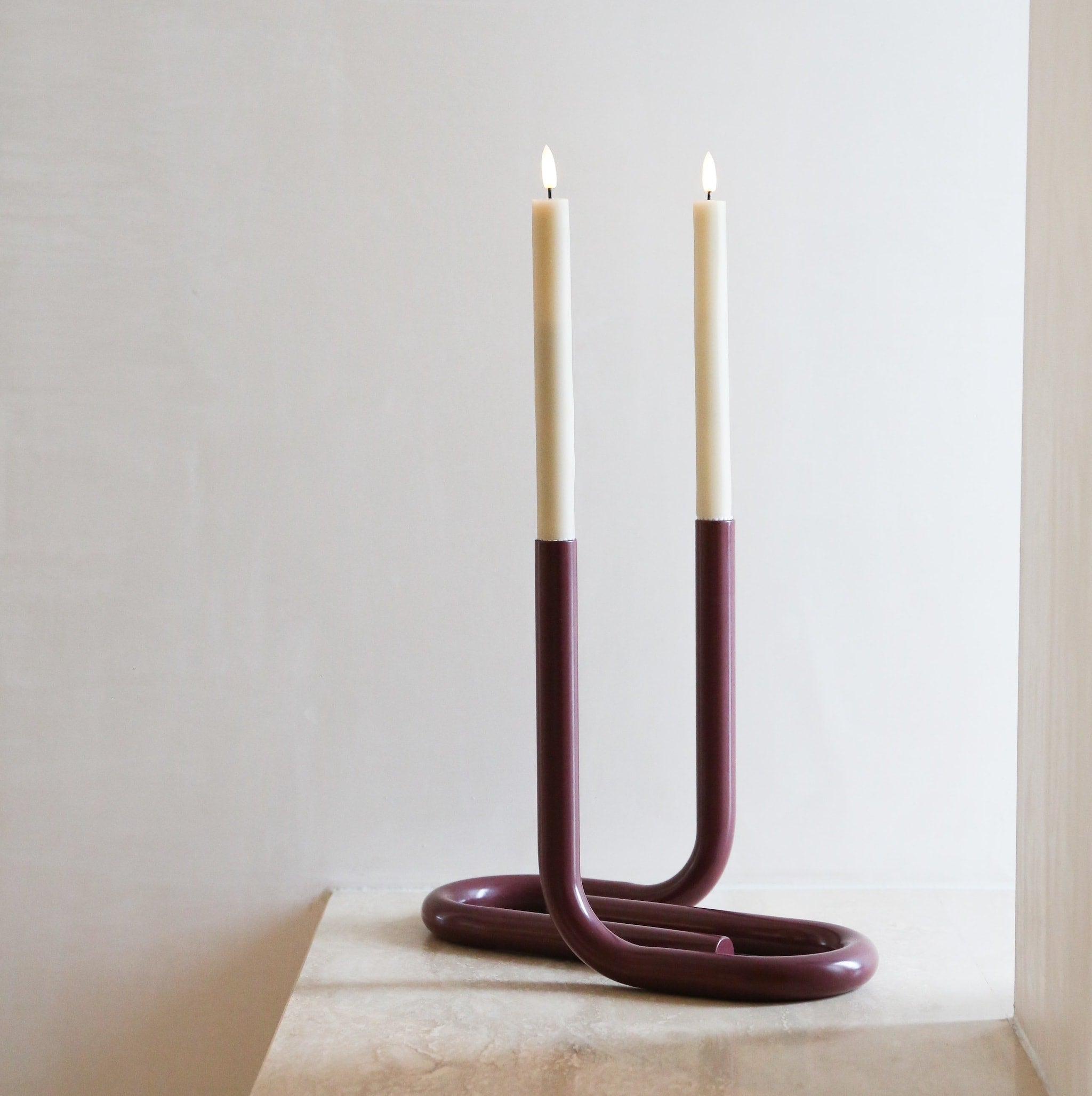
Just about anything can be turned into a focal point. Think artwork, statement furniture, design objects, vases and accent colours – the piece, whatever it may be, ultimately creates interest and injects personality to a room. Work with scale, colour, repetition, and contrast to transform something into an eye-catching moment. And don’t think a focal point needs to be a single object. You can definitely use clusters or vignettes of your favourite pieces to draw even more attention, and create an even stronger focus.
Particularly when using a muted colour palette, and crisp, clean lines, never undervalue the importance of a statement piece. Rather than cramming lots of furniture into a room, opt for carefully considered items that are unique and take a special place in your heart. Curate away!

Image Credit: AYTM

Image Credit: The Paper Collective

Image Credit: Ferm LIVING
Façade
Although we’re told never to judge a book by its cover, it’s often easier said than done… We’re creatures of a certain aesthetic disposition, and are certainly guilty of placing judgement on visual first impressions. And in the realm of design, these first impressions are king.
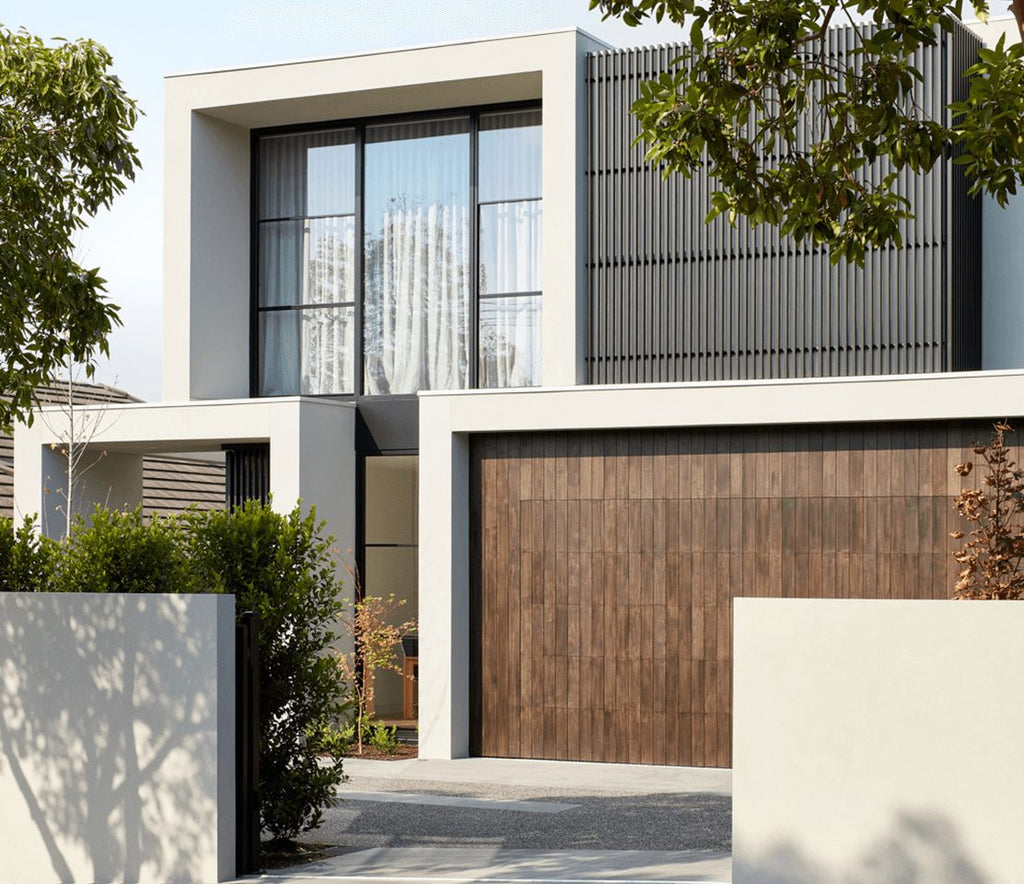
Architecturally, the façade is the face of a building, and a vital aspect from a design perspective. It helps set the tone, create character, and hint at what’s going on with the rest of the design. A gorgeous front façade will undoubtedly make an unforgettable imprint, while speaking to the architectural style, history, and location.
Whether clean and contemporary, or a heritage classic, consider the materials, symmetry and colour in use, and you’re well on your way to creating a stunning and welcoming façade.

Benoit Project by Contekst. Photo by Evenbeeld.

Glen Iris House by Borland Architecture. Build by Concept Build. Photography by Jack Lovel.

A House For A Gardener by Amos Goldreich Architecture. Styling by Jemima Hetherington. Photography by Ollie Hammick.


