The Good Design Journal
Highlight With White - the guide

Though technically the absence of colour, white is a neutral we've found ourselves gravitating towards. You might be thinking, "But why? White is so... plain." And that's a fair question - white may be your go-to when you'd prefer to play on the side of safe, or a default option that 'is never wrong'.
But we're here to change that mentality, because white can be daring, bold, and brave. It's far from limited to just being a safe option, or your convenient fall-back. There's so much potential to unlock! By understanding the way white operates, you can work with it to create striking contrast, a harmonious flow, a break for the eyes, or a intriguingly monotonous scene. Read on, and consider how you can mix things up with a little white in your home.
White On Strong Dark Colour
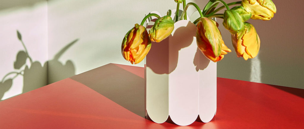
If you love big bursts of colour, white probably isn’t going to be one of your first choices when it comes to decor and styling. But against a bold backdrop, it works insanely well. It’s all thanks to a little thing called contrast – with clean, clinical whites exploding magnificently against a dark solid block of colour.
White on bold colour isn’t for the faint-hearted, and is definitely something you have to commit to. However, the successful pairing and execution of such a scheme is strong and exciting, and creates a buzzing energy. There are plenty of ways to experiment with these schemes. If you’re just looking to dip your toes, try pairing a colourful print with a white frame. If you’re feeling brave (go you), play around with scale – go bold by working white into an oversized lamp (and lampshade), or piece of statement furniture.

White On Soft Colour
You may not think it immediately, but a splash of white creates a beautiful contrast when paired with soft muted colours. It doesn’t shock as much as it would against a bold or bright colour. Instead it creates a harmonious flow designed to complement and enhance the scene.
Try weaving a little white into tonal schemes of lilac or sage. Start small and experiment with white-themed vignettes using matte white objects or functional accessories. If you’re feeling a little brave, think larger with cushions, throws, and dare we suggest, furniture pieces? The result will be calming and sophisticated, giving the mind a place to rest and relax, and enhancing the softly coloured scheme operating in the background.

White To Create A Break
Interiors featuring strong block colours and rich materiality can quickly become overwhelming, with many requiring a divide or break within the scheme. This gives the eye a place to rest and the brain some time to process and organise.
White, being a bright reflective neutral, is the PERFECT candidate to create a little bit of breathing room between the busy and the bold. Achieving this is simple, and can have a strong result when executed well. Think about incorporating a little white when planning out your splash backs, door and window frames, or countertops.

White On White
Classic and eternal, styling white on white is fail-proof when it comes to decorating. And though we definitely believe there’s a limit (too much white takes us uncomfortably back to the 90’s and early 00’s), working with consideration and restraint can yield some really impressive results.
To make a white on white palette work, you should try and think layers. The overlapping of shape and silhouette creates moments of softly contrasting shadowplay, which in turn, helps create depth. This depth is what keeps a monotone palette interesting, and, in the case of white, steers the scheme away from becoming too washed out. Our advice: work with slightly different shades of white to create subtle contrasts, explore different finishes (glossy, satin, and matte) to see how they interact with one another, and finally, be sure to play around with scale and silhouette to bring a little touch of drama.

Keen to try out a little white on white styling in your own home? Or perhaps you’re ready to bring the drama to that blue wall you’ve been struggling to style. Now that you’re inspired a filled with ideas, take a look through our edit of the perfect white highlight pieces to help kick start your next design story.


